Showing posts with label design. Show all posts

Saturday, 18 February 2012

GORKY HOUSE, MOSCOW


This opulent art nouveau staircase forms the centre piece of Moscow's Ryabushinsky Mansion, now known as Gorky House since 'the father of Soviet literature' resided there for the last 5 years of his life. Originally commissioned by the wealthy industrial/banking Ryabushinsky family, the exquisite building was completed in the first years of the 20th century, now standing as a monument to aesthetic excess on the Malaya Nikitskaya ulitsa (ie street, fool) in an otherwise unremarkable part of the sprawling, polluted city.

The photos below attest to the strangely gloomy atmosphere pervading the building, its exotic interiors, while obviously stunning, evoked a peculiar feeling of claustrophobia. Presumably reaching a terrifying climax for the mansion's residents with the great unwashed baying for bourgeois blood around 1917. The architects left no detail untouched, no cornice unadorned and the mansion stands as a beautiful example of the relatively short but impressive period of art nouveau influenced architecture and interior design in Russia.


Sunday, 27 February 2011

WHOLE LOTTA HOVE

I had another opportunity yesterday to admire the beautiful Victorian curves of Brighton station (below) on the way to visit my dear, dear friend, artist Mrs Gillian Trundle-Hepplewhite.


Gillian lives in the grandiose Palmeira Square area of Hove, in a lovely art deco inspired flat with her original Northern Soul hipster and builder husband John. Goldsmiths alumni Gillian agreed to give me a crash course in screen printing, but not before I took the grand tour of their amazing living space full of exotic wares she had accumulated over the years...


Along with the stylish accessories like the vintage Mickey Mouse and beautiful modernist carved bust above, Gill and John's house was full of hip period detail like the elegant curved wall and neutral-toned, minimalist, marblised shower below.


The upper levels of the property contained a number of skylights, the master bedroom featuring an enchanting view towards the pretty St. John the Baptist Church perched on the Western end of the regency-era Palmeira Square (below). Gill's flat sits in a brilliant location, the beautiful church up the northern end of her street, while Hove's lovely seafront lies at the southern end, a matter of a few minutes walk away. 


Gill and John's outdoor space included this beautiful solid vintage sun dial below and other small but perfectly formed accessories.


Gill showed me some fine examples of her screen printing work, inspired by John's northern soul roots and his enormous vinyl collection which runs into the many hundreds. The stark, detailed print below is a post-modern tribute to the music obsessive and a nice interpretation of the numerous nights spent under the Hepplewhite roof way past midnight with the turntables turned up to 11... 


Gill's other obsession is the retro graphics and art deco aesthetics so integral to the city of Miami and the Florida Keys area. The influence is clear in pretty, stylised prints like this hip one below.


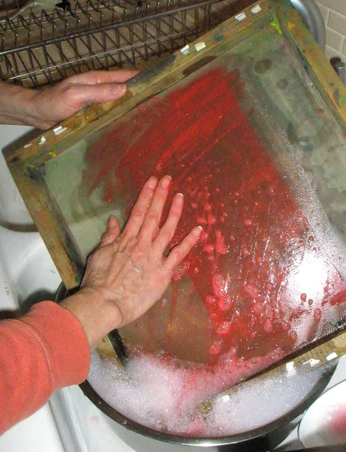
We finally got down to brass tacks with a run-through of the basics of screen printing a simple stencil. Gill let me down gently by informing me that the crappy vintage silk screen frame I had picked up at a garage sale in Australia for $8 wasn't up to the job...however my squeegee was the business so all was not lost. We did a few simple prints - featuring a crude rendering of Gill's favourite symbol - and viola!...a few very, I mean VERY rough images emerged. Luckily Gill was still smiling despite that crimson paint threatening to go all over her beautiful new kitchen fittings.



After all that hard work, it was off for a twilight stroll around Hove's grand Palmeira Square. The descending sun created a beautiful sunset over the wooden beach huts as the square gradually illuminated with cosy, warm hues eminating from luxurious lounge and dining rooms. The grand, spacious flats seemed to be full of idiosyncratic furnishings and characterful charm, the rainy pavements reflecting a magical, opulent ambience. Not a single stick of Brighton Rock to be seen...gotta love Hove.


Monday, 6 September 2010

LA ROSA VICTORIAN SEASIDE FUN

I wanted to do a separate post about my lovely boutique hotel in Whitby - La Rosa - as it was such a quirky, eccentric bolthole combining an intriguing historical pedigree (C.S. Lewis had stayed in my room) with decadent vintage interiors (below).


The La Rosa enterprise initially opened in 2004 with a vintage caravan site, enabling people to glam it up in charmingly retro caravans stuffed full of vintage wares, while endorsing a recycled, environmentally-friendly ethos. The campsite proved so popular two years in a row, it was impossible to book a summer pitch and I had to cut my losses and settle for the hotel experience instead. Which was, of course, fabulous.  


The two pictures above show the rickety old front drawing room, chock full of vintage finds harking back to the pre-war years and beyond. The focal point of this charming room was the huge dining table complete with delicious homemade sweetmeats...providing an atmospheric space for guests to indulge in a decadent afternoon tea whilst taking in the views over Whitby harbour towards the East Cliff. 


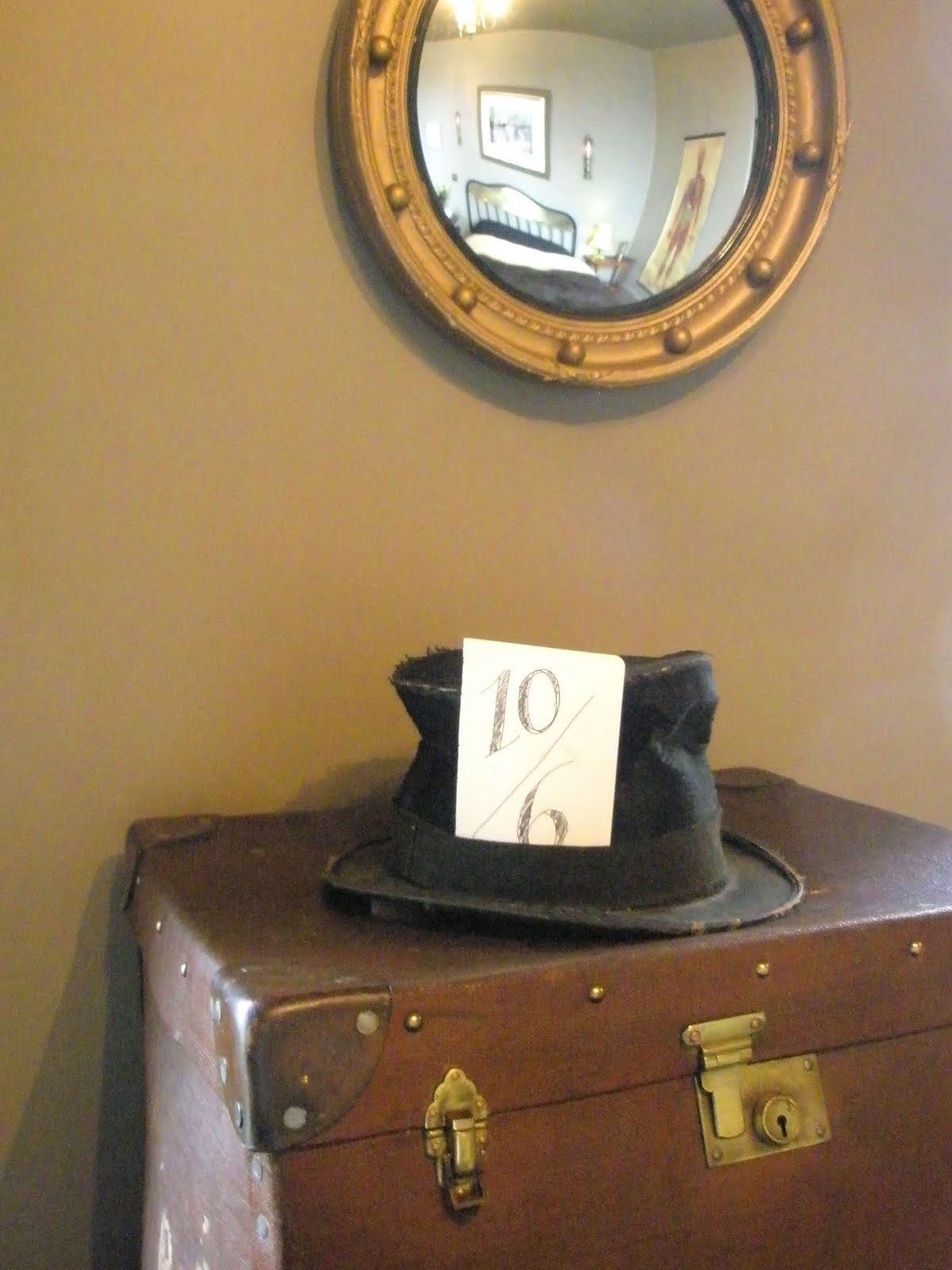
Above shows some random interior styling of the underground restaurant area of the hotel which was closed during my visit but I snuck down to take a few pics anyway. Below was my famous 'Lewis' room (based on an idea of what the author's study may have been like) - with stunning sea views, a working vintage telescope and loads of fantastic old scientific objects, like the ancient medical chart strung up on the wall. The bed was divinely cosy and the slightly eccentric boiled eggs and cheese scone breakfast delivered up to the door of a morning in a wicker basket provided an unusual touch. Each of La Rosa's eight rooms are decorated according to a different theme - the little glimpses I caught of some of the other rooms looking even more sumptuous than mine....


Tuesday, 9 February 2010

BAUHAUS


 I've always been down with style over substance. When my weird Scottish high school art teacher Mr McLean (who let us listen to The Buzzcock's 'Orgasm Addict' in class) introduced me to Art Nouveau I fell in love with its exaggerated ornamental feminine forms. Paris Metro? Yes please. Beardsley and Mucha's gorgeous statuesque women? Too, too cool.

So I was initially unimpressed with the whole 'functional design' ethos of the Bauhaus movement that followed. It all sounded rather structured, overly strict, masculine and well...darkly, frighteningly German. Dumbo soon saw the error of my ways when I came to appreciate the huge impact Walter Gropius's vision had achieved during the short Weimar period. You know you're onto something once you get closed on account of your degenerative influence.
The Modernist Bauhaus influence on architecture, interiors, furniture and graphics made the centuries of ornamental craftsmanship preceding it seem hopelessly outdated. Clean, minimalist design harmonised an object's aesthetic with its function. Mass production linked the design of household products with the increasing industrialisation of the age. A new post-war era had arrived and didn't it look agonisingly hip.

I did the triple-threat Bauhaus pilgrammage to Berlin, Weimar and Dessau on my travels, visiting many of the original still-functioning buildings. It was a real privilege to see the remnants of a socially democratic vision of a well-designed environment made real. Next stop Israel for the post-WW2 chapter.
Images courtesy of Google